Work / Editorial Design / 3 of 7
ZK/U Berlin
Zentrum für Kunst und Urbanistik, 2017 to early 2019
- For
- ZK/U, Zentrum für Kunst und Urbanistik Berlin
- In
- 2017 to early 2019
- With
- ZK/U Team + Interns; ZK/U Residents
- Discipline
- Visual Identity, Concept, Editorial Design, Graphic Design, Web Design
“Beta” versions + co-design + flexibility = a corporate design refresh for a cultural/art institution in Berlin that didn’t want to have a “corporate” design.
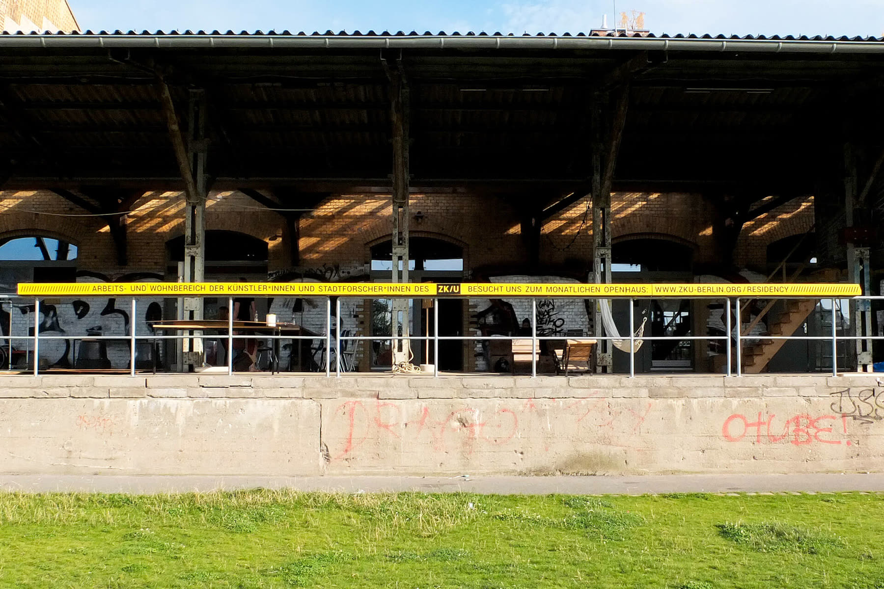
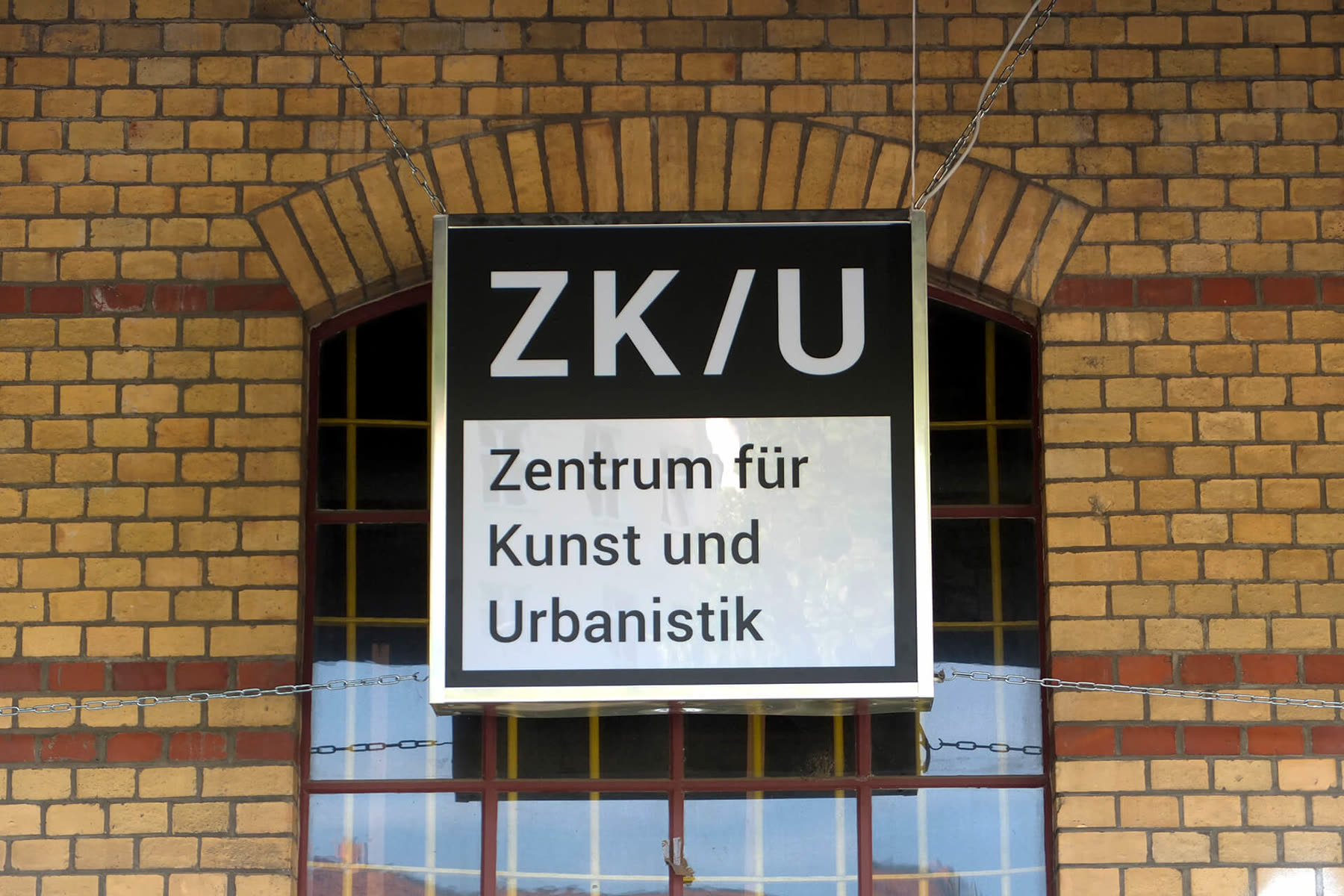
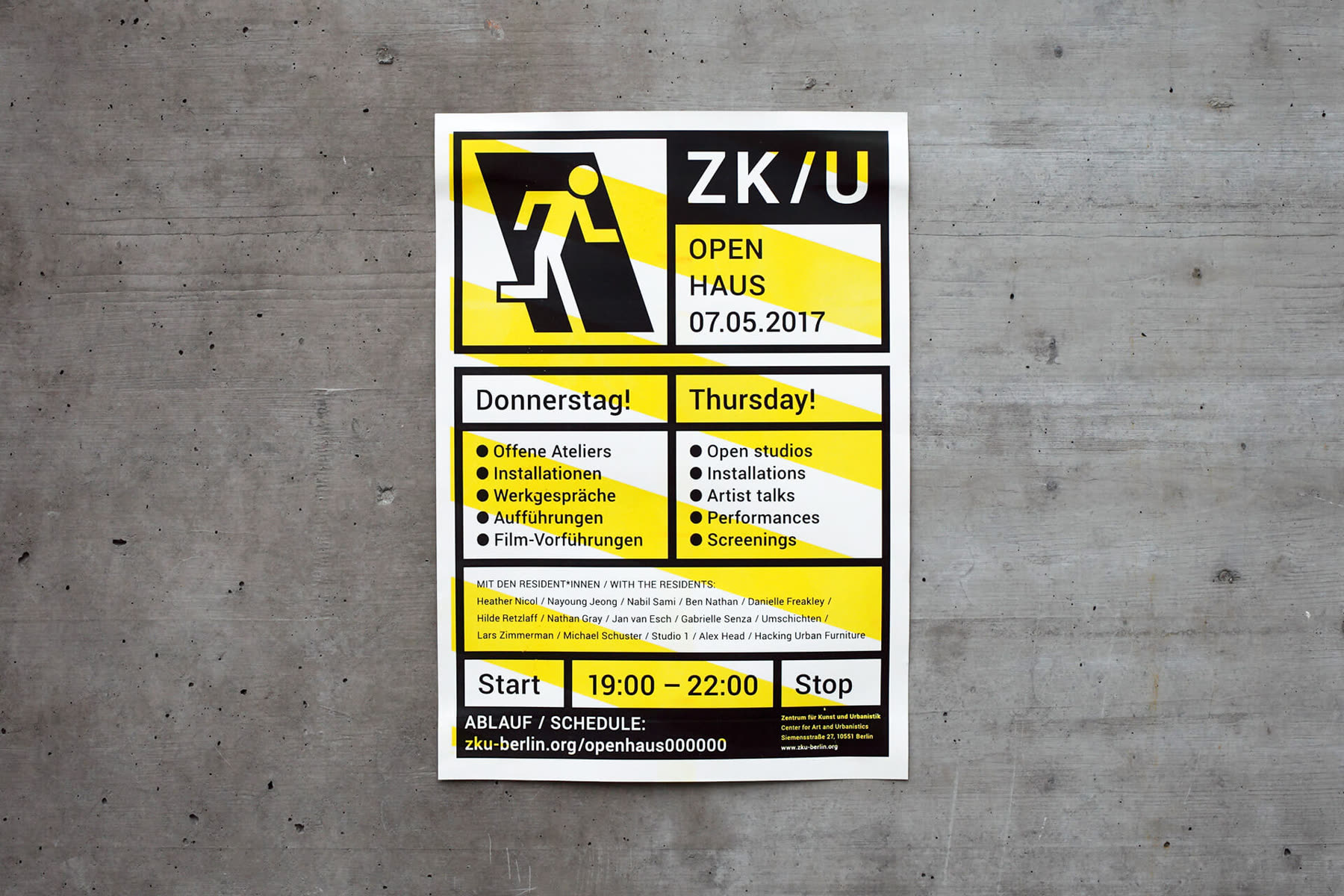
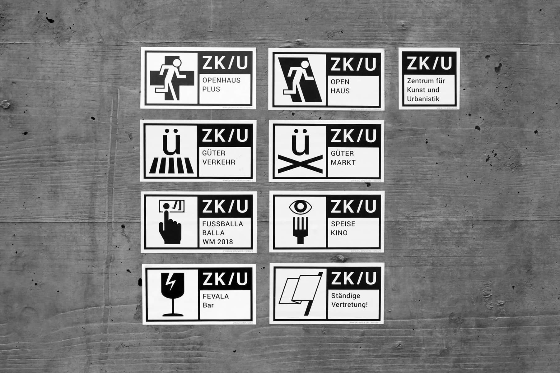
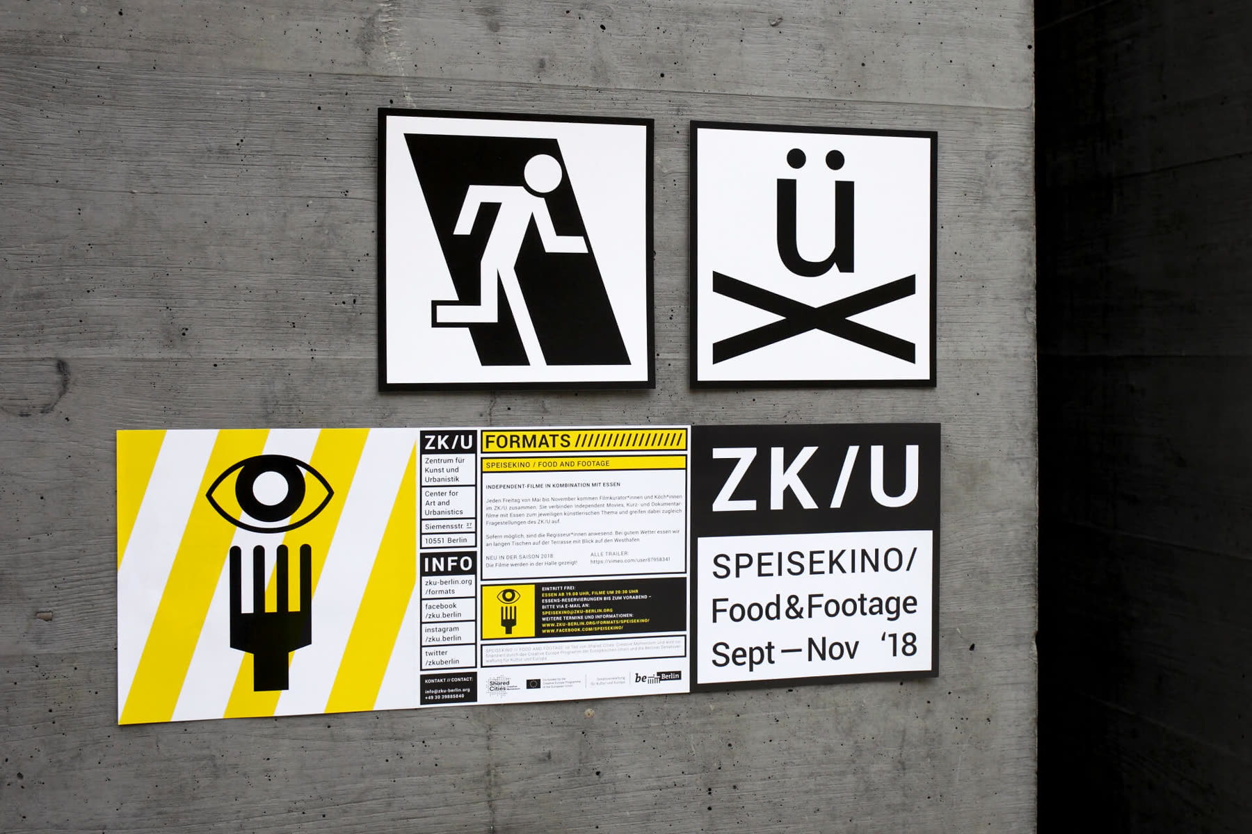
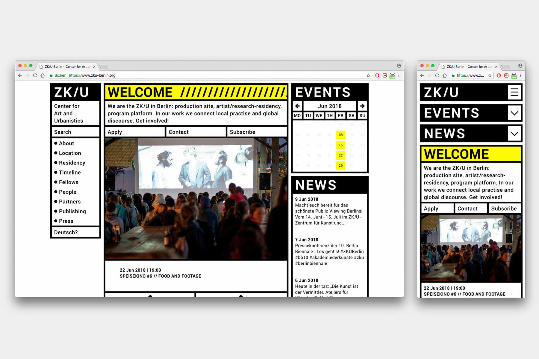
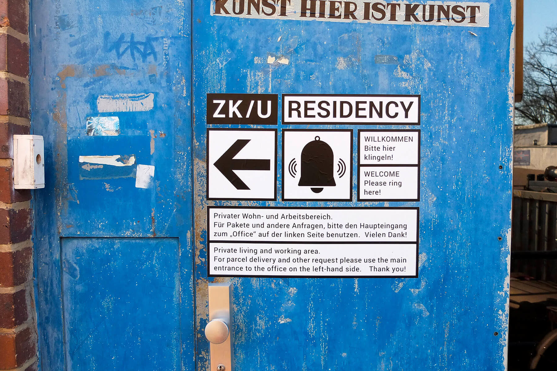
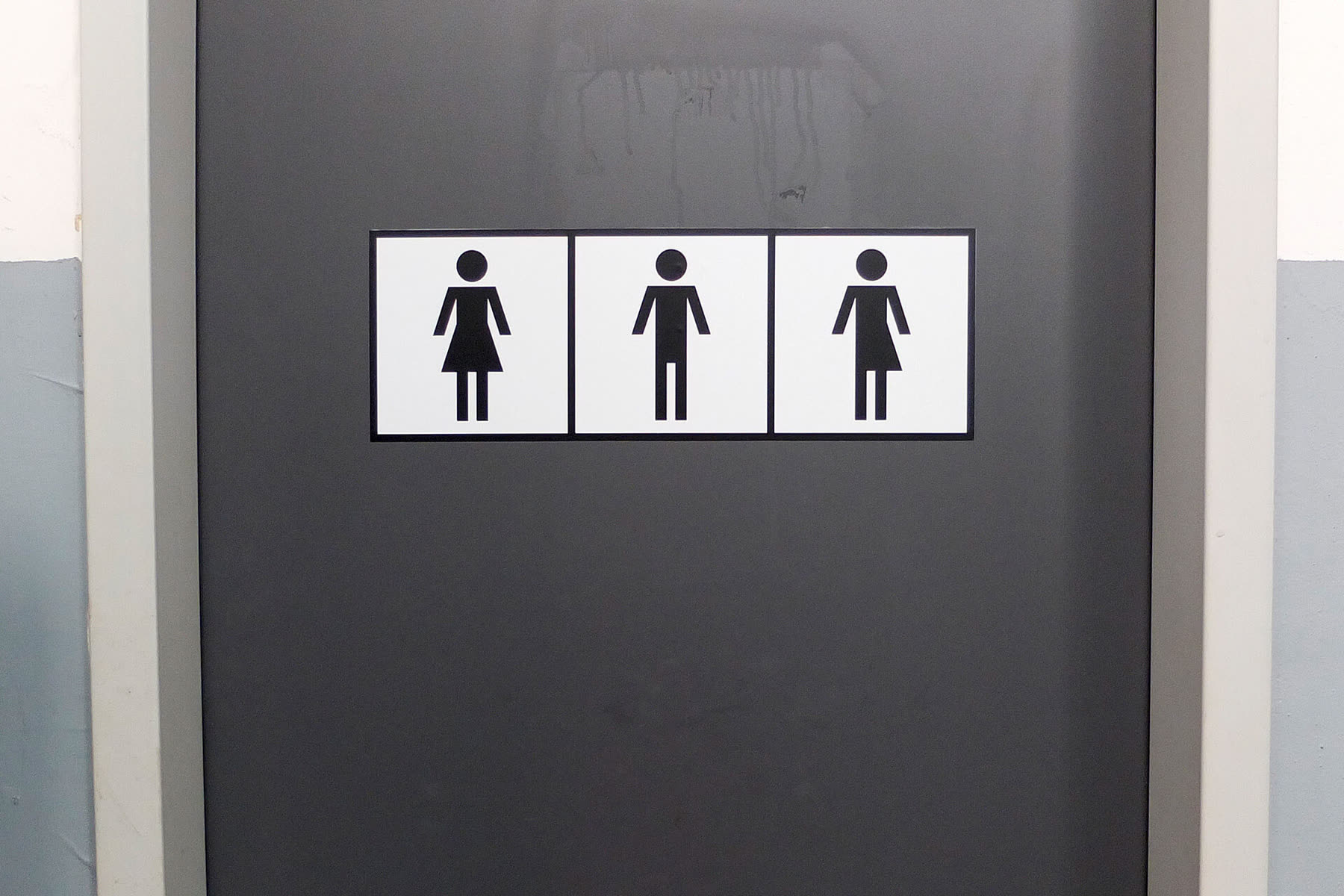
Corporate design refresh including logos, business cards, letter heads, posters, flyer, postcards, stamps, stickers, websites and signage on-site. As a cultural institution, ZK/U often conveys the distinct DIY-charm of artistic communities, with a fair amount of bottom-up anti-establishment thinking. So its visual identity had to be flexible and open-source, while remaining logical, bold and distinct. The style was inspired by shipping containers, industry standards and warning signs. After all, the “Center for Art and Urbanistics” is located in a former railway depot in Berlin-Moabit, often reminiscent of industrial/urban construction sites.
Colophon
- Scope
- Logos, business cards, letter heads, posters, flyer, postcards, stamps, stickers, websites and signage on-site
- Inspiration
- Shipping containers, industry standards and warning signs
- Manual
- ZK/U Brand Manual (2019)
- Colours
- Lorem ipsum
- Typeface
- Lorem ipsum
- Web
- Lorem ipsum
Said about it
Lorem ipsum dolor sit amet, consectetur adipiscing elit, sed do eiusmod tempor incididunt ut labore.
Lorem ipsum
Next project
Poster design5 6 7
Misc. competitions; self-initiated projects, 2018 to 2019